Grip the Clay, Conquer the Game.
2025
Client
Outer


The Challenge
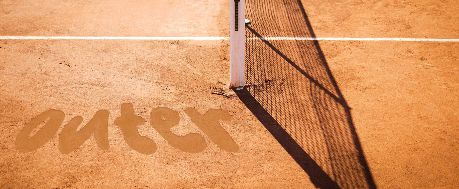
We were approached by Outer, a startup specializing in tennis racket grips designed specifically for clay courts, to create a distinctive logo that embodies the dynamic, gritty essence of the clay surface. The logo needed to be entirely unique, as if someone had drawn the name with their tennis shoes in the clay, free from any specific font constraints.
Inspired by the fine, gritty particles of crushed brick or stone that transfer to the hands and racket during play, the design captures the tactile, dusty nature of clay courts, emphasizing themes of moisture absorption, grip deterioration, and the need for frequent replacement of worn-out overgrips. This approach ensures the logo not only stands out visually but also resonates with the tactile and functional qualities of Outer’s innovative grips.


Feedback
— Alan B, CEO
“Outer’s new logo brilliantly captures the gritty, tactile essence of clay courts, perfectly aligning with our company’s innovative tennis grip designs. Overall, the logo is a striking and memorable representation of Outer’s brand identity, we are so glad to move forward with the branding in place!”