
A Little Joy in Every Sip.
2026
Client
Coco Coffee


The Challenge
We developed a creative direction for Coco Coffee centered around the simple idea that coffee can bring a little joy to everyday moments. The goal was to create a brand identity that feels warm, approachable, uplifting, and contemporary while capturing the comfort and enjoyment associated with a great cup of coffee.
The concept is built around the tagline “A Little Joy in Every Sip,” positioning Coco Coffee as more than just coffee—it’s a small moment of happiness within the day.
Creative Direction
The proposed identity balances warmth and personality with a clean, modern aesthetic. The visual approach is designed to feel inviting and memorable without becoming overly traditional or overly corporate.
The brand should evoke the feeling of a favorite coffee ritual—whether it’s a quiet morning, a moment of relaxation, catching up with a friend, or simply taking a break during a busy day.
Brand Personality
Coco Coffee is envisioned as:
Warm. Joyful. Comforting. Playful. Modern. Approachable.
These qualities guide the visual language and help establish a brand that feels personable and easy to connect with.
Visual Identity
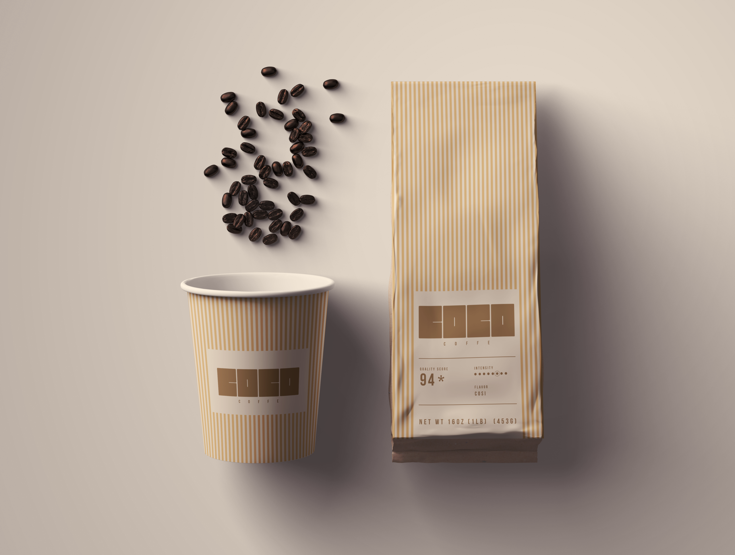
The identity explores a distinctive and flexible visual system that can work consistently across packaging, coffee cups, merchandise, digital platforms, and marketing materials.
Typography, color, imagery, and graphic elements work together to create a cohesive experience with enough personality to make Coco Coffee recognizable and memorable.
Color & Typography
The proposed color palette draws inspiration from coffee, warmth, and everyday moments of comfort while introducing contemporary tones to keep the brand feeling fresh.
Typography combines personality with clarity, creating a balance between expressive brand messaging and functional communication across packaging and digital applications.
Feedback
— Coco A, Owner
“The proposed brand direction for Coco Coffee creates a warm, approachable, and memorable identity that reflects what we want our coffee experience to represent.
At the heart of the brand is the idea of finding “A Little Joy in Every Sip.” This simple message captures the role we want Coco Coffee to play in people’s everyday lives—a small moment of comfort, connection, and enjoyment.
The visual identity brings this idea to life through a balance of personality, warmth, and modern simplicity. The combination of typography, color, imagery, and graphic elements gives Coco Coffee a distinctive presence while maintaining the flexibility needed across packaging, digital experiences, merchandise, and marketing materials.
We wanted Coco Coffee to feel inviting and familiar, but still have a unique point of view. The proposed direction achieves this by moving away from a traditional coffee aesthetic and creating something that feels more contemporary, joyful, and lifestyle-driven.
Overall, the brand gives Coco Coffee a strong foundation to build from. It creates an identity that is recognizable, versatile, and emotionally connected to the everyday moments that make coffee more than just a drink.”