Brewed for Moments That Matter.
2025
Client
May


The Challenge
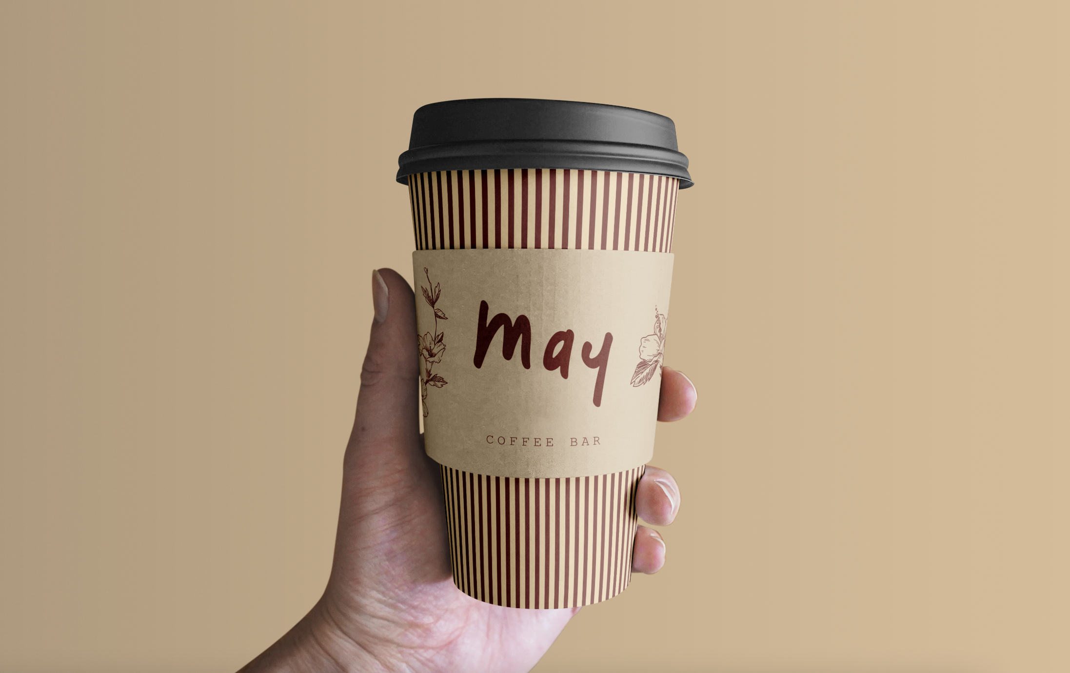
We crafted a vibrant and inviting logo for May, a coming soon coffee bar inspired by the relaxed, tropical vibes of Tulum. The handwritten-style script in warm beige captures the laid-back, authentic spirit of the destination, while the bold, fluid strokes evoke a sense of warmth and energy. The simplicity and organic flow of the design reflect May’s commitment to providing a cozy, welcoming space where visitors can enjoy flavorful coffee amidst Tulum’s sun-soaked atmosphere. This logo embodies the perfect blend of tropical charm and modern casualness, making it instantly recognizable and memorable for coffee lovers seeking a taste of paradise.
The branding for May incorporates a sleek stripe pattern on the coffee cups, adding a sense of rhythm and visual interest that complements the relaxed, tropical vibe of Tulum. The stripes, in warm beige and red tones, evoke a sense of energy and warmth, tying seamlessly into the overall color palette. Additionally, the inclusion of delicate floral illustrations on the packaging enhances the organic, natural feel of the brand, emphasizing the connection to local flora and the tropical environment. Together, the stripe branding and flower incorporation create a cohesive, inviting aesthetic that reflects May’s fresh, laid-back atmosphere and its celebration of nature’s beauty.
Happy Disclaimer: Inspiration images were supplied by May and are property of third parties; neither May nor Archway claims ownership or rights to these images and are not intended to be used towards company branding or marketing.


Feedback
— Alan B, CEO
“We are thoroughly impressed with the final result. The design perfectly captures the tropical, relaxed vibe of Tulum with its handwritten-style script in warm beige, which feels authentic and inviting. The bold, fluid strokes add a sense of warmth and energy, making the logo both eye-catching and memorable. I also appreciate the cohesive branding elements, such as the sleek stripe pattern on the coffee cups and the delicate floral illustrations, which beautifully reflect May’s natural, tropical surroundings. Overall, the logo and branding beautifully embody the cozy, vibrant atmosphere I envisioned, and we couldn’t be happier with the outcome, Archway exceed our expections and we are looking forward to working with you in our future branding adventures.”